Targeted advertising is different from regular advertising because it focuses on a specific audience. The goal is to show the ad to people who fit certain criteria like gender, age, marital status, and location. The advertiser’s job is to create content that will appeal only to the desired audience. They use various techniques such as metaphors, color schemes, puzzles, and mascots.
Now, let’s start by talking about the mistakes that can ruin an advertisement, aside from having a bad product or using a generic template.
- Using stock images: When you use pictures that are easily found on the internet and used by many others, your ad can look cheap and out of place. These images don’t represent your brand and might have been used by other companies as well. They don’t provide much information about your product. This issue also applies to using generic templates. Some marketers think a template is just about adding text and a picture, without considering if the picture makes sense. Research shows that high-quality images have a greater impact on purchase decisions than reviews and lengthy descriptions, according to MDG Solutions.
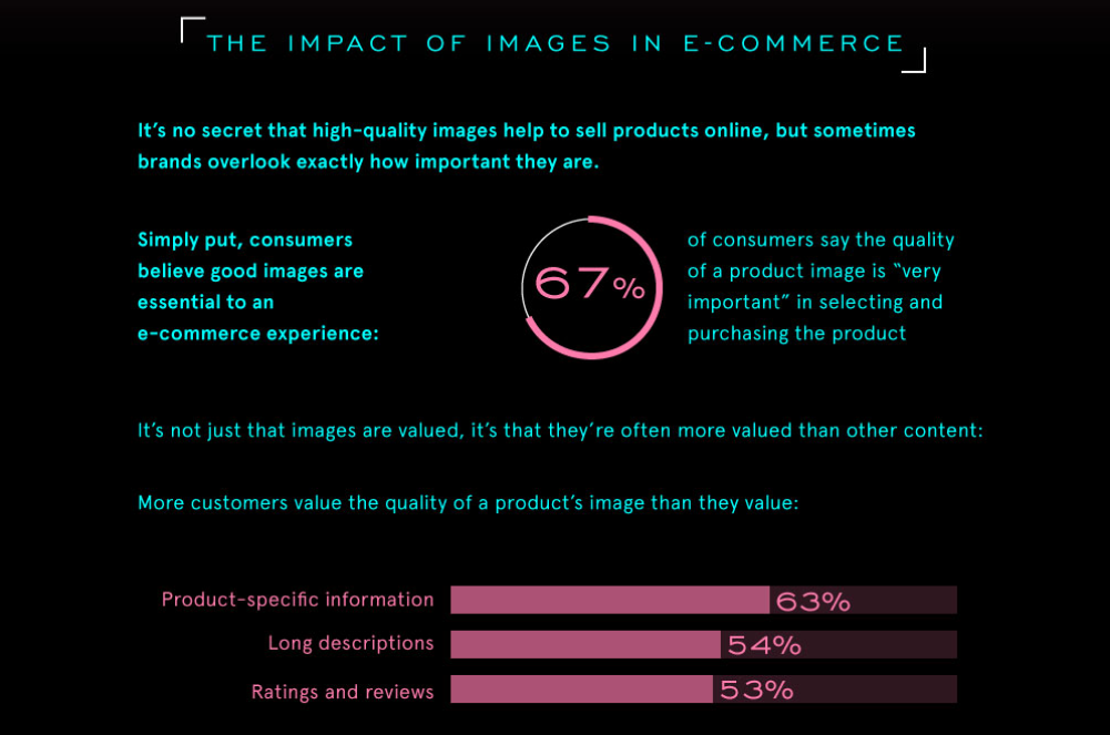
It’s better to use pictures that are relevant to the theme of your ad. The image should convey what the user will get from the advertised product.
- Boring text: The text in your ad should evoke emotions in your target audience and address their specific needs. It should be clear and specific, hitting on their pain points. Sometimes marketers write phrases like “get a loan” or “visit our store,” or they focus too much on product features. Users generally don’t respond well to such ads. Your ad needs to catch people’s attention, but these empty templates fail to do so.
- Lack of ideas: A good idea can bring your ad to life, while a boring idea will kill your ad’s performance. Users have become adept at ignoring most advertisements, so to overcome banner blindness, you need something eye-catching and unconventional, even if it’s based on a template.
To illustrate these mistakes, here are four examples of ads that incorporate all of them:

Using random pictures from the internet that don’t match the text or convey any emotions, and not including a clear call to action, is a mistake. It’s confusing because we don’t know what product is being advertised or what makes it special. We can’t understand the idea behind these poorly designed ads. They are like empty templates that fail to catch people’s attention.
To create high-converting ads, follow these simple rules:
Use informative images and illustrations: Use pictures, mascots, or real customer photos to grab attention. These images should give people an idea of what they’ll get from your product. Informative images are more convincing and help people understand your product better. Ads with pictures usually work better than text-only ads.
Include a call to action: Sometimes affiliates forget to include clear instructions for people to take action. Make it easy for them to buy your product or visit your store.
Write text that interests your target audience: Your text should have something that appeals to the people you’re targeting. Talk about the benefits that matter to them or tell a story that they can relate to. Your text should evoke emotions and promise solutions to their problems.
Make sure the text in pictures is easy to read: The letters in your pictures shouldn’t blend, and the font should be clear and attractive. The text shouldn’t distract from the image or look out of place.
Be creative and unique: The key to a good ad is having a unique idea. Most ads are generic and don’t stand out. You need something eye-catching and different to grab people’s attention. Mascots, catchy slogans, special colors – these things make your ad more interesting.
Now, let’s take a look at 16 successful examples that follow these rules. These ads gave brands a high return on investment and boosted sales by 1.5, 2, or even 3 times. We’ll see what tricks they used in these ads. We’ll also compare the results with the previous ad campaign before they made changes and improved the ads.
Examples of successful case studies
Case Study 1: How Brain Sensei Boosted Sales by 382%

Results Compared to the Previous Ad Campaign
- Conversion rate (CR): 31%
- Return on ad spend (ROAS): +382%
- Revenue: +31%
Why it worked:
Brain Sensei sells educational courses. Their ads featured their recognizable mascot, Brain Sensei, which caught people’s attention. They created a sense of urgency and offered a promotional code for a 5% discount as a gift. The most important information was highlighted in red to make it stand out.
Case Study 2: How MyTracker Lowered Advertising Costs by 132%
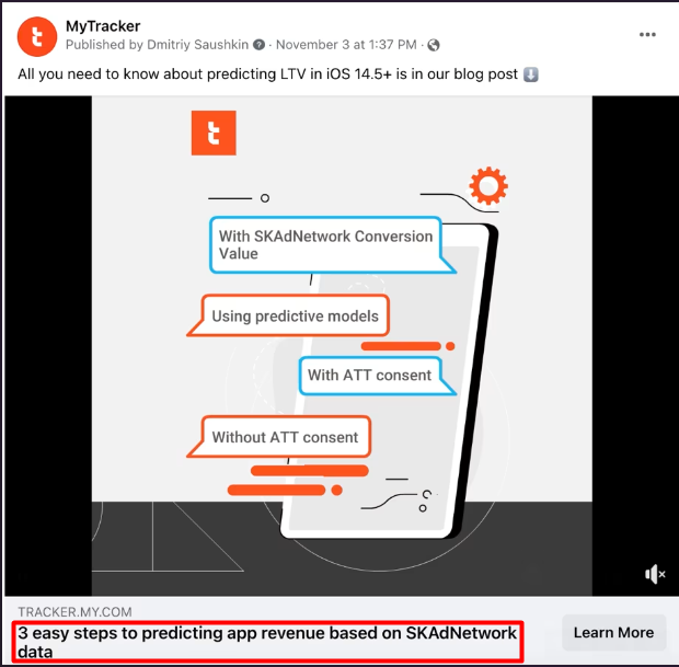
Results Compared to the Previous Ad Campaign:
- Cost per Click (CPC): $0.43 compared to $0.63 in the previous ad.
Why it worked:
MyTracker sells analytics software. They used a classic approach where the ad leads to an article, and the article leads to a landing page. The ad image showed the main points of the article without giving away everything. The image was high-quality, easy to read, and didn’t have elements overlapping. The main goal was to generate interest in the article through a link.
Case Study 3: How Finmark Moods Got 148 Clicks for $0.17
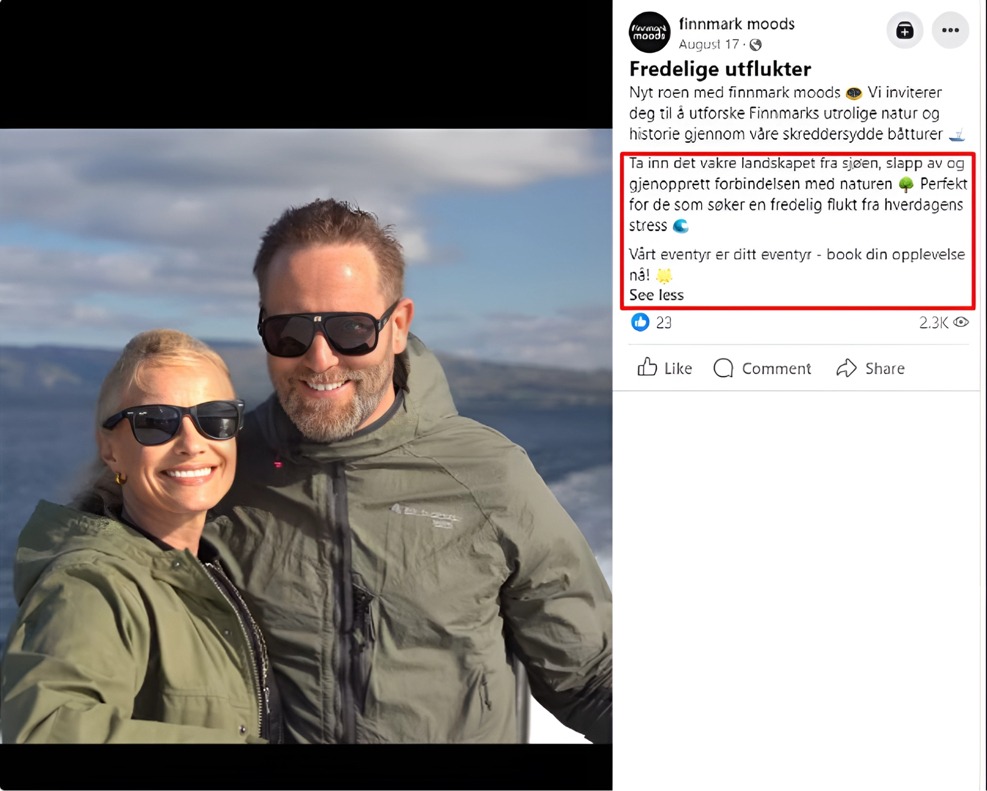
Ad campaign results:
- 148 clicks for $0.17
Why it worked:
The ad showed real satisfied customers, identified the target audience, and played on people’s emotions. It made readers feel that if they went on the same tour, they would feel good, happy, and confident like the people in the photo. The text promised a calm, quiet, and relaxing experience with beautiful Norwegian views, addressing what the target audience wanted. This kind of advertising template usually works well in most cases.
Case Study 4: How Sugar and Crumbs with Nifty Nozzles Increased Sales 50 Times
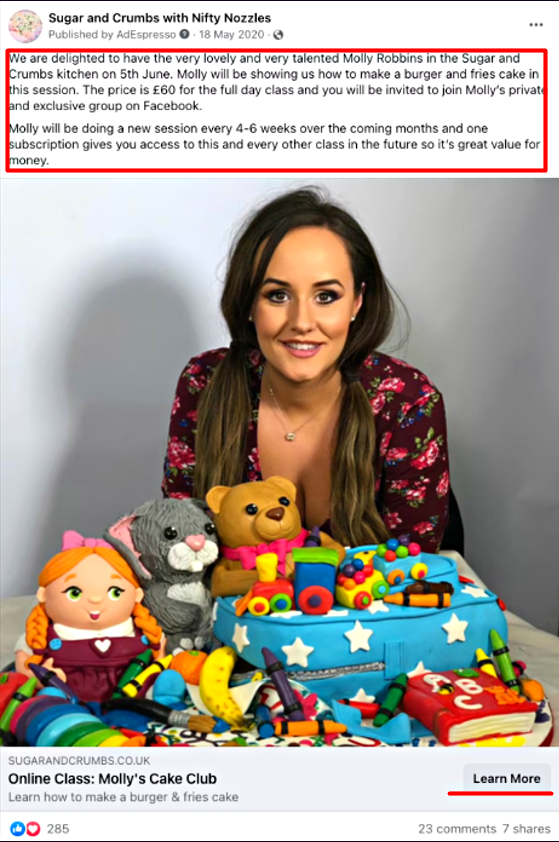
Ad campaign results:
- 25,000 subscribers in the Facebook group
- Sales Volume: 3 times higher
- Return on Ad Spend (ROAS): +66%
Why it worked:
Sugar and Crumbs with Nifty Nozzles sells sweets. Their ad featured a well-known cook, Molly Robins, which grabbed attention. The text promised affordability and quick success, and having a celebrity involved strengthened people’s trust. The template they used explained the celebrity’s participation, showcased what would happen at the webinar, and highlighted the benefits. This type of template with a celebrity often works well.
Case Study 5: How Strategyzer Made Sixteen Times More Profit
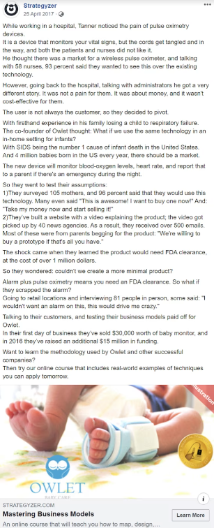
Ad campaign results:
- $8,000 income from product sales with an advertising cost of $500
Why it worked:
Strategyzer sells courses on mastering the Owlet business model, which is their main product. It’s a complex product that needs a detailed explanation. The image in the ad was meant to catch people’s attention. The main idea of the ad and similar templates was to tell a long and interesting story about the emergence of a business model. They mentioned Owlet naturally within the story and provided a clear call to action at the end. This storytelling template is effective for technically complex products.
Case Study 6: How GRIN Reduced the Cost Per Lead by 29%
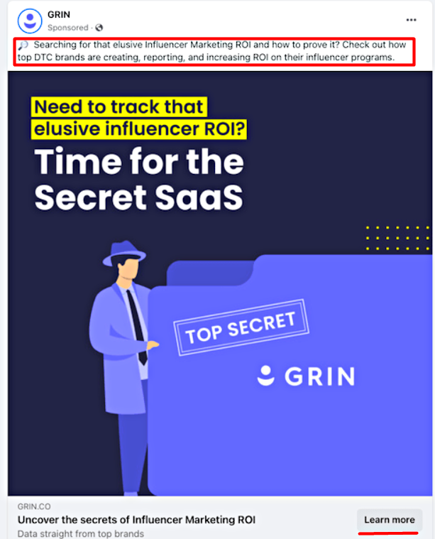
Results Compared to the Previous Ad Campaign:
- The cost of acquiring potential customers (CPL) decreased by 29%.
Why it worked:
GRIN sells a marketing tool. They used a successful template that grabbed people’s attention with a catchy headline and a question. The ad focused on generating interest and promising benefits to the people they wanted to reach. The idea was to create a sense of secrecy and make users feel like they would learn something exclusive by clicking on the link. The image they used had the words “TOP SECRET” on a blue background to make it stand out. This template worked well for products in the Nutra and Cryptocurrency verticals, where sharing secret knowledge and using a landing page can be effective. It followed a classic advertising funnel template.
Case Study 7: How Swolverine Increased Return on Ad Spend by 136%
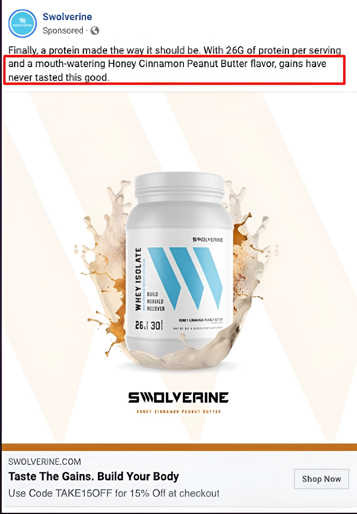
Results Compared to the Previous Ad Campaign:
- ROAS +136%
Why it worked:
Swolverine sells dietary supplements. They focused their creative on the unexpected aspect of their product—the taste. Most dietary supplements have unpleasant or bland tastes, so the fact that Swolverine’s supplements tasted good was surprising to their target audience. The main idea of the ad was to challenge people’s expectations about the product. This approach can be effective when advertising unusual products.
Case Study 8: How FASHIONPILE Reduced Conversion Cost by 27% and Increased Return on Ad Spend by 76%
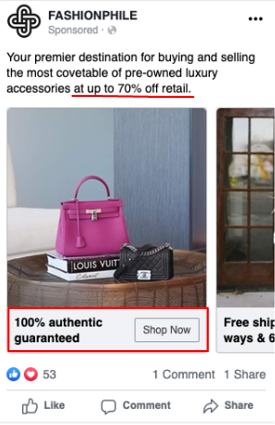
Results Compared to the Previous Ad Campaign:
The CPL decreased by 27%.
They made 76% ROI from their ads compared to before.
Why it worked:
FASHIONPILE sells branded clothing. Their ad featured a branded bag from their collection. Instead of using stock photos, they used real pictures of their products, which helped build trust with the audience. The text in the ad emphasized a big discount and a 100% guarantee, followed by a call to action. This creative worked because the company was selling an expensive product and the guarantee and discount made it more appealing. The ad aimed to make people want to buy as soon as they saw it. The target audience desired branded items at affordable prices. This simple template is effective for ads in the e-commerce vertical.
Case Study 9: How MiWay Increased Purchase Conversion Rate by 5 Times
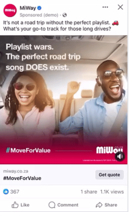
Results in comparison with previous Ad campaigns:
- The number of people who made a purchase increased by 5x.
- The number of people who signed up for more information doubled.
- The number of people who completed the registration process increased by 8x.
- More people became aware of the brand, with a 32% increase compared to before.
Why it worked:
MiWay offers transport services. Their ad showed happy people on a journey, aiming to create positive emotions in viewers. They used real pictures, not stock photos, to build trust. The main feature of the ad was an open question, asking viewers about their favorite choice of music. This sparked people’s interest and had the potential to make the ad go viral.
Case Study 10: How Bath & Body Works Arabia Reduced Cost Per Lead by 27%
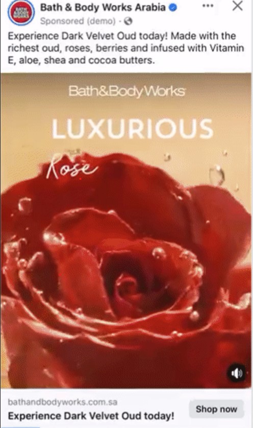
Results Compared to the Previous Ad Campaign:
- The cost of getting people to visit their website decreased by 13%.
- It became 27% cheaper to motivate people to make additional purchases on their site.
- It became 10% cheaper to motivate people to make additional purchases in their stores.
Why it worked:
Bath & Body Works Arabia sells skincare products. Their creative used a color scheme of dark red and burgundy, which are associated with luxury and create the perception that owning such a product elevates social status. The ad aimed to give a sense of premiumness to the product.
Case Study 11: Sifted Boosted Conversion by 5100%
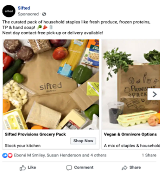
Results Compared to December 2019 (before COVID-19):
- Conversion Rate (CR): Increased by 5100%
- Revenue: Increased by 4232%
Why it worked:
Sifted offers a food package that has all the nutrients you need. Their advertising strategy was smart. They focused on customers getting a great selection of top-notch products at a low price, and it was easy to pick up the package. During the 2020 lockdown, the convenience of getting all the necessary products with just one click became a big advantage. If you want to create a similar campaign, make sure to highlight that users can get a complete set of products easily. But remember, this approach only works if your offer allows for it. The key is to make it simple for users to get the products without much effort.
Case Study 12: SnackSurprise Gained 25,000 Subscribers
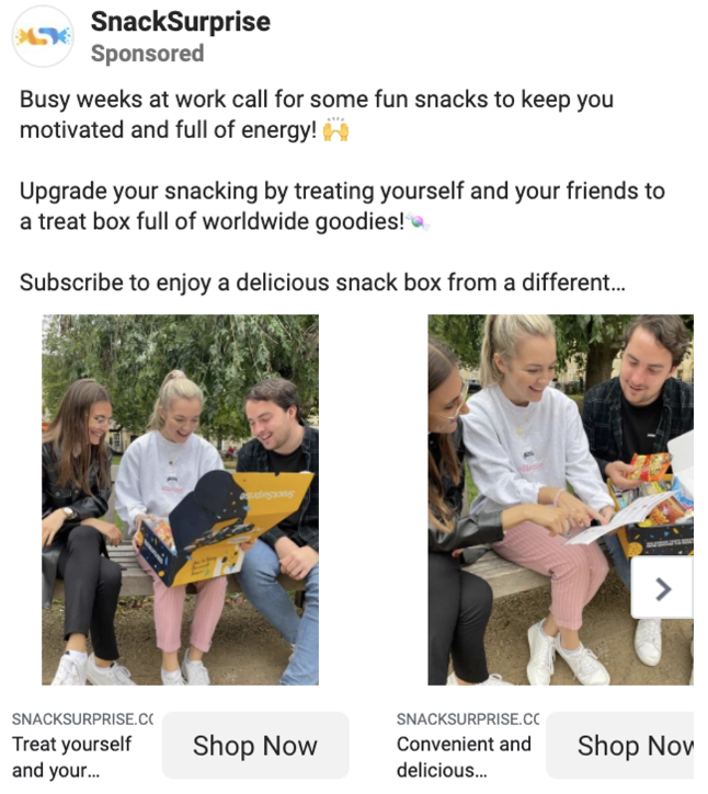
Ad Campaign Results:
- Subscribers: Increased by 25,000
- Return on Ad Spend (ROAS): Increased by 324%
Why it worked:
SnackSurprise sells surprise boxes filled with sweets and snacks. Their ads tapped into people’s social needs. They showed how you could treat your friends and share positive emotions with them through their products. The ads highlighted successful social interactions, like enjoying snacks with colleagues or friends.
Case Study 13: Seltzer-Goods Achieved 1000% ROAS Increase
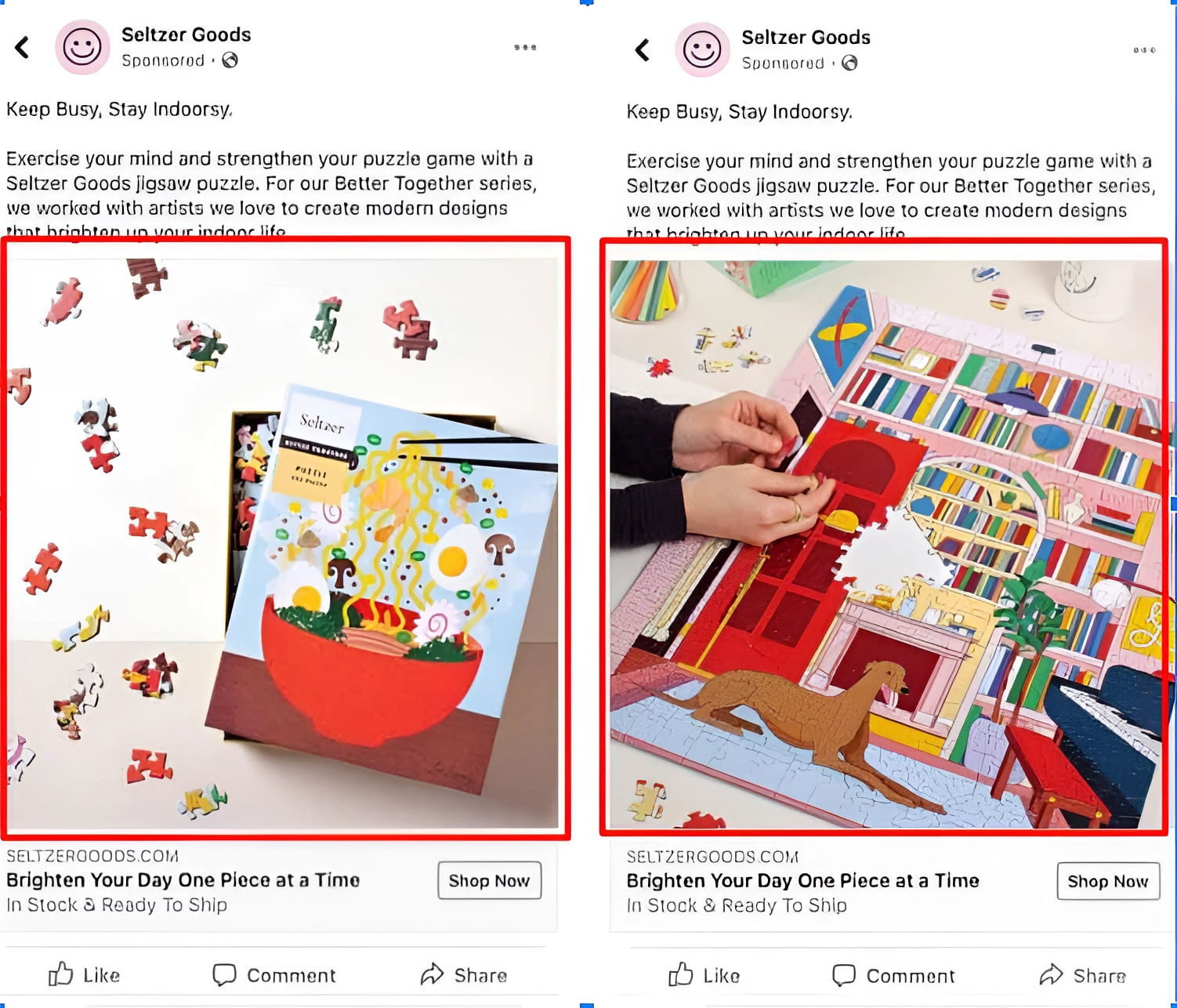
Results Compared to the Previous Ad Campaign:
- Return on Ad Spend (ROAS): Increased by 1000%
- Revenue: Increased by 785%
Why it worked:
Seltzer-Goods sells beautiful and complex puzzles. Their ad campaign had a few key elements. They used a catchy slogan that rhymed to explain why their product is necessary. The ads also emphasized that famous artists and designers created the puzzles, which made people trust the brand and want to learn more about the artists and their work.
Case Study 14: How Pura Vida Bracelets Increased Sales by 6x
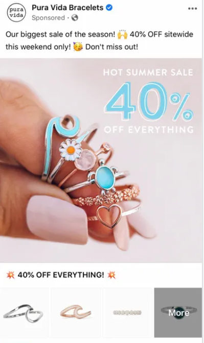
Results Compared to the Previous Ad Campaign:
- Profits: Increased by 20%
- Sales Volume: Increased by 6.3x
Why it worked:
Pura Vida Bracelets sells jewelry. Their main creative idea for this campaign was urgency. They offered a discount on all their products for just one weekend and included a clear call to action. The ads showed unique and unusual jewelry pieces from different collections. By creating a sense of limited time, the campaign successfully convinced customers to make a purchase.
Case Study 15: Watchfinder reduced CPP by 30%
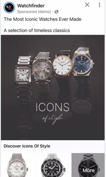
Results Compared to Previous Ad Campaigns:
- Cost per Purchase (CPP): Decreased by 30%
- Sales Volume: Increased by 40%
- Return on Ad Spend (ROAS): Increased by 2.1x
Why it worked:
Watchfinder specializes in premium watches. Their creative approach focused on recognition. They showed specific watch models that have become classics in the industry. The target audience already knew these watches and was likely looking for similar models. By featuring these watches in the ads, the campaign caught the attention of the target audience.
Case Study 16: Good News Maternity Wear Achieved Cost per Lead (CPL) of $0.04
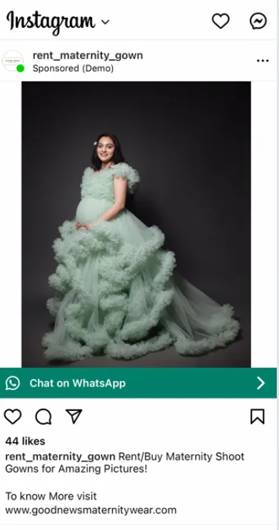
Advertising results:
- Reach: 77 thousand people
- Cost per Lead (CPL): $0.04
Why it worked:
Good News Maternity Wear sells stylish clothes for pregnant women. Their creative approach offered an alternative. They allowed customers to both buy and rent items. The ads emphasized renting clothes for one-time photo shoots, which is a common practice in India. The visuals showed a happy pregnant woman at a photo shoot, which resonated with the target audience. Additionally, including a call to action through WhatsApp was a smart idea since it’s a popular messaging app in India. Making it easy for customers to connect with the brand through WhatsApp worked well. The ads followed a classic template, featuring a satisfied representative of the target audience.
Conclusion
Targeted advertising won’t work well if you don’t have engaging and effective creative content. Creative content is a crucial part of any marketing strategy. However, even with proven templates, coming up with compelling creatives can be challenging. It’s not always clear which template will convert into successful ads, and it’s hard to predict which creative approach will be effective.
At Wealth Ideas, we have experienced account managers who can assist you with your creative needs. They can provide guidance, optimize your campaign, and help you scale your advertising efforts. Whether you need help brainstorming ideas or refining your existing creatives, our team is here to support you. Don’t hesitate to reach out to us at any stage of your advertising journey. We will be more than happy to assist you.

Pingback: How to Run an Effective Push Notification Ad Campaign